
By Christina Hecht. Artistic workshops provide wonderful opportunities for learning new techniques and sharing ideas with like-minded crafters.
Discover how to create beautiful scenes with Distress Oxide inks.Mountains, hills, and deserts come to life in fabulous colors.
Patsy Kral, owner of ArtsyStamps & Paper Crafts, offers her customers plenty of unique hands-on classes each week in her Loveland,Colorado, store. Susan Mangis Noroski, a talented stamper who works at the store, teaches many of the workshops.
One of Sue’s recent workshops featured suns and moons as the focal points. Distress Oxide inks were sponged in layers to create the sky and landscapes.
Midnight Tree

(Stamp credit: Tree—Dark Room Door.)
“All of the cards are very easy to do, once you sit down and practice,” Sue says. “No two cards will ever look exactly alike, especially if you’re making mountains.”
When teaching the technique, Sue demonstrates each step, but encourages attendees to use their imaginations and make their own color choices. “At first it’s difficult for some, but after they do the first card and see how nice it turns out, they just go to town.”
All the beautiful landscapes shown here were created using the same technique—the individuality of each scene varies depending on the size and placement of the circle stencil, the colors used, and the final images stamped on the scene. Sue stamped Tim Holtz Distress Oxide inks on all the scenes, except for the Midnight Tree card,where she used Distress inks.
For anyone who hasn’t worked with either ink product, Sue provides these in-sights. “Distress Oxide inks are a fusion of pigment ink and dye inks. When I don’t blend the Distress Oxides too much, they can be brighter or lighter than regular Distress inks, but that brightness disappears the more I blend them. When dry, the oxides have a chalky look, which becomes much more apparent the more you blend the colors.
Desert Scene

(Stamp credit: Large desert scene—B&J’s Art Stamps.)
”Here comes the sun (and moon).
The first step entails determining how large your sun or moon will be. A circle stencil is easily made by using a circle die or paper punch tocut out the shape from a piece of watercolor paper. Sue recommends using the heavier and thicker water-color paper for stencils because it provides as light rim and a smoother outer edge.
Determine where the sun/moon will be in the scene and place the stencil over the watercolor paper. While holding the stencil down, use a paint-brush to fill in the space with the liquid masking fluid. Working quickly,apply it in smooth strokes all around the rim and center. When done, lift the stencil upward to avoid disturbing the edges and allow the mask to dry for a few minutes.
When making multiple cards, Suere commends having several stencils on hand because the Frisket gradually builds up on the edges of the stencil.Clean the paintbrush by soaking it in hot water with a drop or two of fabric softener.
With the sun/moon masked, the landscape and sky are sponged in using ink. Once a pleasing background is achieved, the mask on the sun/moonis removed and the final images are stamped into the scene with black ink.
To remove the dried mask, rub over it with a Glue Runner Eraser oruse your finger, but be sure your hands are dry and clean to prevent unwantedsmears. As you lightly rub the edge of the mask, the Frisket will becometacky and wad up into a ball, making it easy to pick up and throw away.
Details and Tips
Details as to how Sue created the scenes in this article are included below. Some additional tips include:
- Apply white pigment ink overyour moon with a sponge to make it appear brighter. In Midnight Tree,white ink was sponged in the sky around the moon to beautiful effect.
- When using blending tools, apply the ink in a circular motion.Begin off the canvas and gradually move onto the paper to achieve smooth, seamless transitions.
- Pigment ink is tackier and stickier than dye ink. Use a heat tool to reduce the drying time of a background before stamping the final image.• To prevent ink from smearing onto her canvas, Sue places construction paper over her craft mat to absorb any excess or stray ink.
Midnight Tree
Sue applied a light purple Distress ink around the outside of the masked moon with a round foam blending tool. When creating scenes, she likes to have quick access to all the tools she needs, so she developed a personal storage system for her blending sponges: a separate foam pad for each color of Distress ink is attached with Velcro to the bottom of the corresponding pad.
A light purple was initially applied around the moon followed by a medium purple to create a deeper,richer shading. Then a dark purple was applied in circles around the other layers. “Don’t worry if you cover some of the light color.”
Chipped Sapphire, a dark blue,was applied around the paper’s edge and ever so slightly into the previously inked layers. Sue lightly applied white pigment ink around the outside of the moon to create a soft glowing halo.
Grass in the Sun

To create the dimensional sky and water in this scene, a dark blue shade was sponged on both outer horizontal edges. A lighter shade of blue was then applied inward from each dark blue layer. A small portion of the watercolor paper between the brown mountains and the sky and water was left untinted—an effect that provides a realistic sense of distance.The sun was tinted yellow and its reflection was added in the water.The brown mountains were created using a stencil and a touch of green was dabbed at their base before the grass image was stamped over the background.
Desert Scene
The essence of a blistering day in the desert, when the air feels like itcould catch on fire, is captured in Sue’s next scene.
The craggy mountains and sandy plateaus stencils were created by tearing these formations out of watercolor paper cut the same size as the finished card. While sponging in the sky, Sue simply held the stencil, which became a mask, with her fingers.
While sponging in the sky, she held the mountain mask down with her fingers—double-sided temporary tape could also be used to secure the mask.
Starting at the top, blue ink was applied in uneven light and dark layers across the card. Then a color called Wild Honey was sponged below and slightly blended into the blue layers. A final pink hue was added below the blue and honey inks.
The sun’s mask was removed and lemon-yellow ink, followed by a fresh coral color, was applied over the circle. Using only the edge of a round blending tool, white pigment ink was added along the bottom edges of the orb to make it appear hotter.
Working downward, the hills and ground were added. When sponging in these scenic elements, keep in mind final images will be stamped onto the scene. Make sure these images line up with landscape features. The general rule of thumb, when creating scenery,is place darkest colors in front and lightest hues in the background.
Using a torn paper stencil made to look like rolling hills, the bottom edge was colored with a dark brown ink.The stencil was re-positioned, and a lighter Vintage Photo brown layer was sponged in above the dark hills.
Sue recommends leaving some white or lighter areas to give the scene“extra dimension.” The stencil was re-positioned again and a light layer of Vintage Photo ink was applied.
Using the mountain stencil, the peaks were sponged into the back-ground in vivid orange. “Covering the lower sky and the sun with this color gives the orange added dimension.”
A touch of white ink was applied around the sun and dried with a heat gun before desert shrubs and sand were stamped with black Versa Fine ink.
Lovely as a Tree
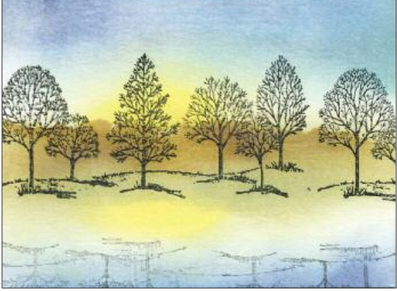
(Stamp credit: Trees—Stampin’Up!)
Lovely as a Tree
Grass in the Sun and Lovely as a Tree were the first cards Sue created with Distress Oxide inks. “I immediately fell in love with the look and the inks and am waiting for the next new batch to be released.”
To create the reflection of the trees in the water for this piece, she inked the image and stamped it on scrap paper before stamping the image upside down at the bottom of the card.