Stamp to the Music by Tonya Weakley
“I enjoy most kinds of music—other than hip-hop and rap,” says Pat Walsh, whose Stamp a Song submissions were such a hit, they wound up filling this issue’s Card Shoppe column. Elaborating on her musical taste, Sue adds “I’m especially fond of ’60s, ’70s, Motown, rock ’n roll, and classical—listening depends on my mood.”
When creating the cards shown here, she said she did “quite a lot of singing,” trying to match her substantial stamp collection to actual songs.
Stamping connections
Pat’s stamp collection took off after she retired from teaching and moved to Peoria, Arizona. Once there, friends asked her to join their stamping group.
“I kept telling them ‘no.’ As a teacher, I’d stamped students’ papers, but that was as far as it went. Plus I knew I was going to like stamping and that would be bad for my craft room—which was already quite full!” Nevertheless, persistence paid off and she joined the group.
Along with gaining inspiration from her friends in the group, a challenge posted in the stamp magazine, Take Ten caught Pat’s eye. Rules were simple—follow a specific layout and create the card in 10 minutes or less.
“I really like things like that,” she says. “I thought this would be a great group project and tried to get the entire stamping group to participate, but nobody was interested.” That didn’t discourage Pat. She made a card, sent it in, and was published, giving her stamping connection/addiction a big boost. “I tell my friends ‘it’s your fault.’ You’ve created a monster!”
We disagree. They created a stamper—one whose stamp art has been published in past issues of RSM, as well as this one. Here’s how she created three beautiful cards on the musical theme.
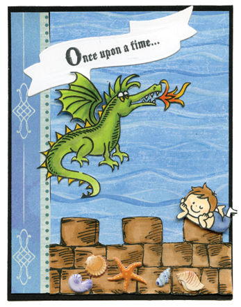
Once upon a time . . .

(Stamp credits: Boy—Waffle Flower Crafts; set with dragon, fire, wall, saying—unknown.)
Pat had the perfect stamp set to illustrate the song “Puff, the Magic Dragon,” released by Peter, Paul, and Mary in 1963. This was the inspiration for her “Once upon a time. . .” card.
With the line “Puff the magic dragon lived by the sea” ringing in her ears, she choose a back-ground paper suggesting sea waves. Another line: “Little Jackie Paper loved that rascal Puff,” meant she needed to add a boy image. Her ”perfect stamp set” included a dragon, fire, seawall, and verse.
Coloring the images with Copic markers, she notes: “I could never get good results with other markers. Copics give me the depth I’m looking for.” Her blending technique is evident on the dragon, who isn’t just one shade of green but three.
She first colored the entire dragon with the lightest shade of green, then added shadows with a darker green. A medium green filled in the “seams,” where the two other colors met. Her finishing touch was smoothing over the entire image with the lightest green.
Her blending technique is also evident on the fire emanating from the dragon’s mouth. Two colors—russet and yellow—work well together there.
Skin tones can be difficult for stampers to duplicate. Pat did an excellent job on the boy, starting with Copic 50 (Egg Shell) to color all his skin. She then added shadows near his hairline, on his arms and feet with Copic 51 (Milky White). Taking the same approach she would when applying makeup, Pat defined the boy’s cheeks with a slant stroke of Copic 93 (Tea Rose).
Once the coloring was complete, Pat carefully cut out each image. “On cards like this, I fussy cut by hand,” she explains. Every point on the dragon’s back, every tooth, and every flame of fire has been carefully cut out. The addition of tiny 3D seashells and starfish stickers at the bottom was the perfect final touch.
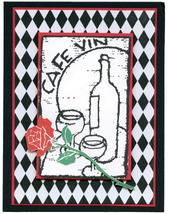
Days of Wine and Roses

(Stamp credits: Cafe still life—Just for Fun; rose—Rubber Stampede.)
For the second card, Pat picked her Café Vin image set and asked herself: “What goes with this?” The song “Days of Wine and Roses” popped into her head and she started the card.
Preferring a predominantly black-and-white scheme, she choose the harlequin pattern paper for background. She found the perfect rose in her collection and colored it with red and green Distress Oxide inks.
After stamping the image and cutting it out, she decided mounting the rose at an angle would create an interesting composition. A coordinating red cardstock was added to frame the two panels, adding additional dimension and interest.
“This is my favorite card because it was super easy and quick to make,” she says. “Plus, it’s kind of sophisticated, as opposed to the other cards, which I think are more whimsical.”
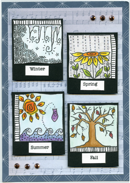
Turn! Turn! Turn!

(Stamp credits: Seasons—Magenta; words—Close to the Heart.)
“Turn, Turn, Turn” was released by The Birds in 1965. It begins “To everything—turn, turn, turn / There is a season—turn, turn, turn. . .” Her card illustrates this song perfectly!
Pat chose a Magenta stamp, which includes four seasonal images and provides an uplifting, cheerful aura.
Pat colored the daisy, sun, foliage, and water with Copic markers. Because Copics are alcohol-based, they blend quickly and easily. At first, the winter image looked rather cold and gray. Pat added glitter accents to make the season “pop” and become more cheerful.
Pat choose an offset pattern for each tile and added titles underneath. She found a background paper that mimicked sheet music, a perfect touch for a musically-themed card.
While Pat loved the offset tile arrangement, she felt the open spaces in the upper-right and lower-left corner needed something more. Rhinestone embellishments added a new shape, as well as sparkle.
To be sure her Stamp a Song submissions effectively illustrated each of the songs, Pat took them to a meeting of her embroidery group, asking members to name each song. They knew them all, confirming her efforts were successful.
Tonya Weakley is the president and primary artist for Peddlers Den, Inc. This company is home of the Makin’ A Scene Stamp Collection at peddlersden.com.

