
Baby Wipe Backgrounds
By Christina Hecht
Officially retired and loving it is how Annie Frazer of Cottage Grove, Minnesota, enthusiastically describes her current situation: “It gives me more time to play with stamps and ink, and now I actually have the time to really experiment with inks and explore new techniques.”
And experiment she does, all the while letting her imagination and creativity co-mingle. The backgrounds in each of the four cards featured here were artfully created with what Annie calls the Baby Wipe Technique. Annie was introduced to the technique while taking a workshop with mixed media artist and Dylusions stamp designer Dyan Reaveley, in which baby wipes were used to apply acrylic paints to cardstock.
“I wish I could take full credit for this,” says Annie. “I do use paints, but not on cards, so I thought, ‘I bet I could do this with other types of inks.’” And adapt the technique she did by using baby wipes to apply ink onto cardstock with pleasing results.
Annie uses the baby wipes right out of the package and finds most any brand will do. When a wipe becomes too dry and no longer moves and blends the inks effortlessly, she simply pulls out a new clean, damp cloth. The stamper offers a caveat: when a baby wipe is too moist, the technique doesn’t work as well.
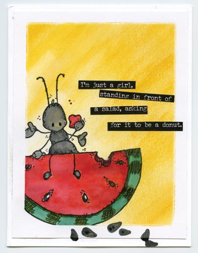
(Stamp credits: Ant, watermelon—Whipper Snapper Designs; watermelon seeds—Fun Stampers Journey.)
The Oxide difference
When doing this technique Annie favors the Distress and Distress Oxide line of inks. The stamper finds that Distress Inks produce a softer look than the Distress Oxide inks, which are bolder, brighter, and when used with water to activate the oxide properties have that “wow factor.” Occasionally she uses both ink types on a single card.
Some characteristics Annie especially favors about the inks are the colors and how they blend seamlessly together, attributes she hasn’t found with standard dye-based inks. “It takes a lot of work to really get regular dye inks to blend. I also like that the Distress colors work well together, and you don’t have to spend time trying to figure out what colors work well with each other.”
The unique watercolor effects are also appreciated. “I like that I can get these effects with water and don’t have to wait quite as long for things to dry. The saying, ‘Oh ye of little patience’ certainly applies to me.”
Using the proper types of paper is an important element with this technique and Annie opts for either a 98 lb mixed media paper or a 90 lb watercolor paper. “I prefer the mixed media paper with the baby wipe technique because it’s thinner, tends to be smoother, and makes blending easier.”
Gorgeous results
Annie relishes this technique because she prefers making her own background papers over buying printed paper. “It’s an amazingly simple way of adding color to a page and nine times out of ten it will be gorgeous. I’ve only had a few times where I just went ‘ugh,’ but we won’t talk about those.”
When making multi-colored backgrounds for cards Annie recommends selecting two or three colors that work well together so that the background doesn’t become too “overwhelming.” And should a background not turn out as envisioned, she never throws it away. “Sometimes what I think hasn’t turned out works really well when I start adding stamp images.”
Another trait of the Distress inks Annie finds appeal-ing is the ability to remove the ink from under and around a stamped image even after the ink has been applied. To do so she adds a little water on the area to be lightened and then gently dabs at it with a paper towel to remove the water and color. “You can also just paint right over the background and that produces some cool effects, too.”
Annie also uses Distress inks to color stamped images; she stamps the ink pad onto an acrylic stamping block, spritzes the ink with water until it puddles and then picks up the color using a waterbrush. A craft sheet may be used in lieu of an acrylic block.
When shading images, the stamper initially wets the brush in a puddle that consists of more water than ink; as the shading becomes darker, she picks up color from puddles having more ink. “It’s basically the same thing you do with watercolors. You never need a lot of ink on the acrylic block so daub lightly with the ink pad to not waste ink. You can always add more if needed.”
Baby Wipe Technique
- Wrap a fresh clean baby wipe around your finger and dab it against an ink pad to pick up some color and apply it directly to the cardstock. When selecting a different color, use a clean spot on the wipe so the colors don’t become muddy.
- Depending on the effect you want to achieve, apply the ink in a dabbing motion or wipe the color back and forth over the cardstock.
- It’s possible to seamlessly blend two or more colors on cardstock using a wipe. Begin at the outermost edge of each color and, with a light touch, make small circular motions on the paper toward the other color until the hues eventually merge.
- Let the ink dry and stamp directly over the background.
Enjoy the Journey
Both Distress and Distress Oxide inks were used on watercolor paper in the vivid card featuring a bee on page 16. The bee was stamped with black Versafine Archival ink and colored—a touch of glossy medium applied to the wings makes them shine.
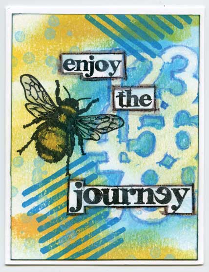
(Stamp and stencil credits: Sentiment—Stampers Anonymous; bee—Darkroom Door; dots, dashes—Stampin’ Up!; stencil—Balzer Designs.)
A smattering of dots and bold dashes were randomly stamped over the background, then a stencil of interlocking numbers was placed over the scene and traced with a blue Derwent Inktense colored pencil.
The sentiment was stamped on paper and the words were individually cut out and attached with adhesive. The words stand out because they were outlined with a black Inktense pencil followed by a water brush to lightly smear and blend the pencil medium.
The waterbrush was also used to blend the blue pencil outlining the numbers to create depth and make them visually pop on the card. Inktense pencils are not inexpensive and Annie notes that she’s used regular watercolor pencils for this technique with success.
Happy Day
The empty glass bottle was stamped on mixed media paper and masked off prior to Pumice Stone ink being applied over the background with a baby wipe. Using a mister, the background was lightly spritzed with water so Annie could “move the color around” using her fingers until she obtained an effect she liked.
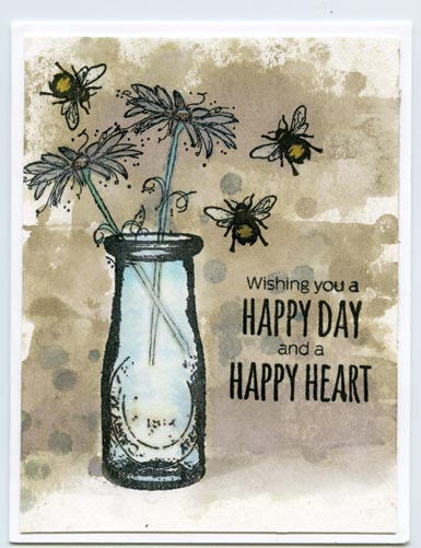
(Stamp credits: Sentiment—Penny Black; flowers, background stamps—Darkroom Door; bees—Indigo Blue; vase—Viva Las VegaStamps!)
A small solid circle stamp inked with Pumice Stone and Iced Spruce oxide inks was stamped repeatedly and randomly over the background and allowed to dry. The flowers, bees, and sentiment were stamped with Versafine Archival Onyx Black ink and Copic markers were used to color the flower, bees, and inside of the bottle. Visual highlights were added by accenting the wings of the bees and the water in the vase with a glitter pen and applying gloss to the centers of the flowers. Girls Just Want Donuts
The background was created by tapping Wild Honey ink on an acrylic block, spritzing the block with water and using a paint brush to apply the medium over the paper. Annie pre-determined where the central image would be stamped and simply avoided brushing ink in that area. The images were stamped with archival ink and the watermelon and ant were colored with Distress Oxide inks diluted with water and painted using a waterbrush.
When Annie doesn’t have a stamp sentiment befitting a scene, she turns to Small Talk stickers from Tim Holtz. “They come in pads with a bunch of super-fun, snarky sayings or beautiful thought sentiments.”
Speed of Life
The background was created by swiping Distress inks in blues and grays with a baby wipe and a very light touch over 98 lb Canson Mixed Media paper. The same technique was used to create the natural looking green grass.
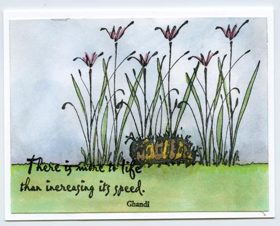
(Stamp credits: Sentiment—PSX; flowers—Stamps by Judith; caterpillar—Art Impressions.)
The images were stamped with Versafine Clair Archival ink because the ink works well with water—Annie has also used Mementos Tuxedo Black ink with success. Distress inks diluted with water and a waterbrush were used to tint the flowers, stems, and two-toned caterpillar. Final details were added using Copic markers.
Christina Hecht lives in southern Oregon, where she stamps, gardens, and enjoys the countryside.